Choosing options
One-sided or two-sided business cards: how to choose
Give each side a purpose so the card stays easy to read.
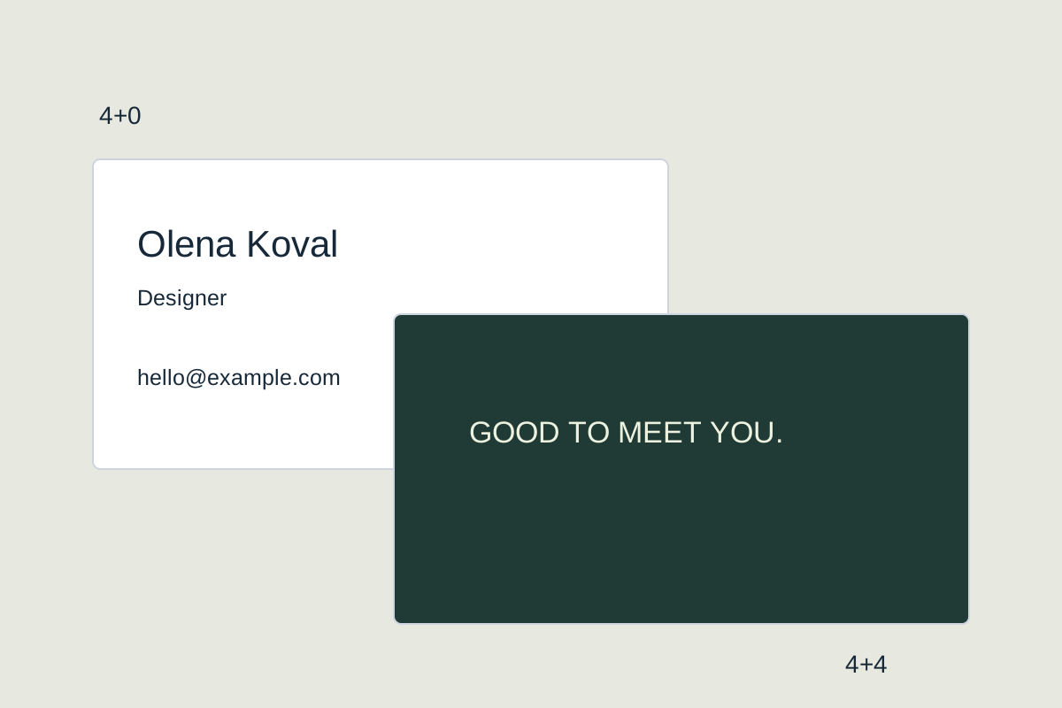
Give each side a purpose so the card stays easy to read.
Give each side a separate job
One side can be enough for a name, role and main contact. A second side is useful for a slogan, concise services or coupon terms. It does not need to repeat the phone or photograph. Decide what someone should see when you meet and what they will read later. Dividing by purpose is clearer than moving half the lines to the back.
Divide content by the moment of contact
The front works during the introduction, when someone needs to find a name, brand, or main benefit quickly. The back works later, when the card comes out of a wallet or drawer. It can carry concise services, a loyalty mechanic, a promotion code, or one emotional accent. If the back has no distinct purpose, a one-sided card is often clearer.
Front: name, role, phone and website. Back: a short slogan and one visual accent.
Decide this before generating
- 4+0 means full colour on one side.
- 4+4 means full colour on both sides.
- Name the side and what to preserve in every edit.
Check whether the two sides repeat each other
Make separate lists for the front and back, then remove repetitions that do not help someone act. A phone may belong on the front while a booking QR code belongs on the back; a name can lead on the front while a slogan sits alone behind it. This preserves breathing room and gives both sides a reason to exist.
Common questions
Do contacts need to appear on both sides?
No. Repeat them only when it supports a specific use case. Usually the primary contact belongs on the front and the back carries a different message.
When is the back genuinely useful?
When it helps a next action: it can hold a QR code, coupon terms, a concise service list, stamp spaces, or a slogan that should not compete with contact details.